

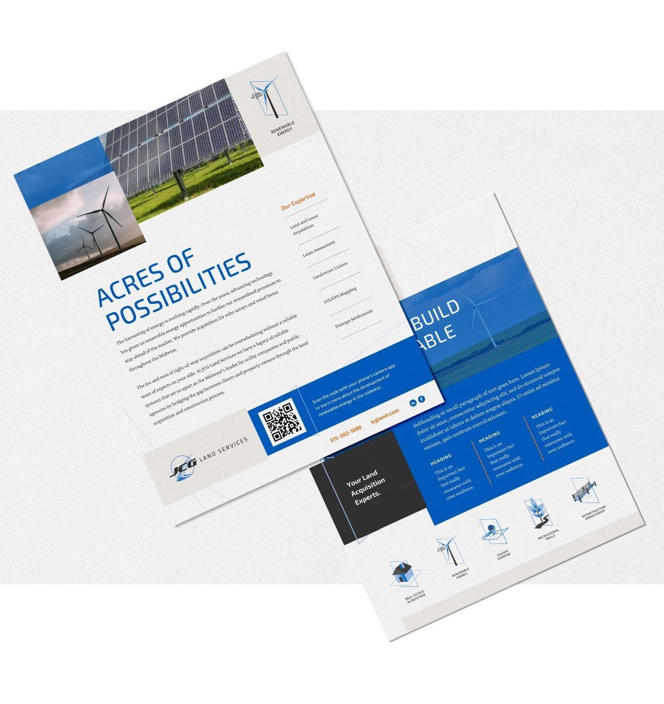
JCG Land Services
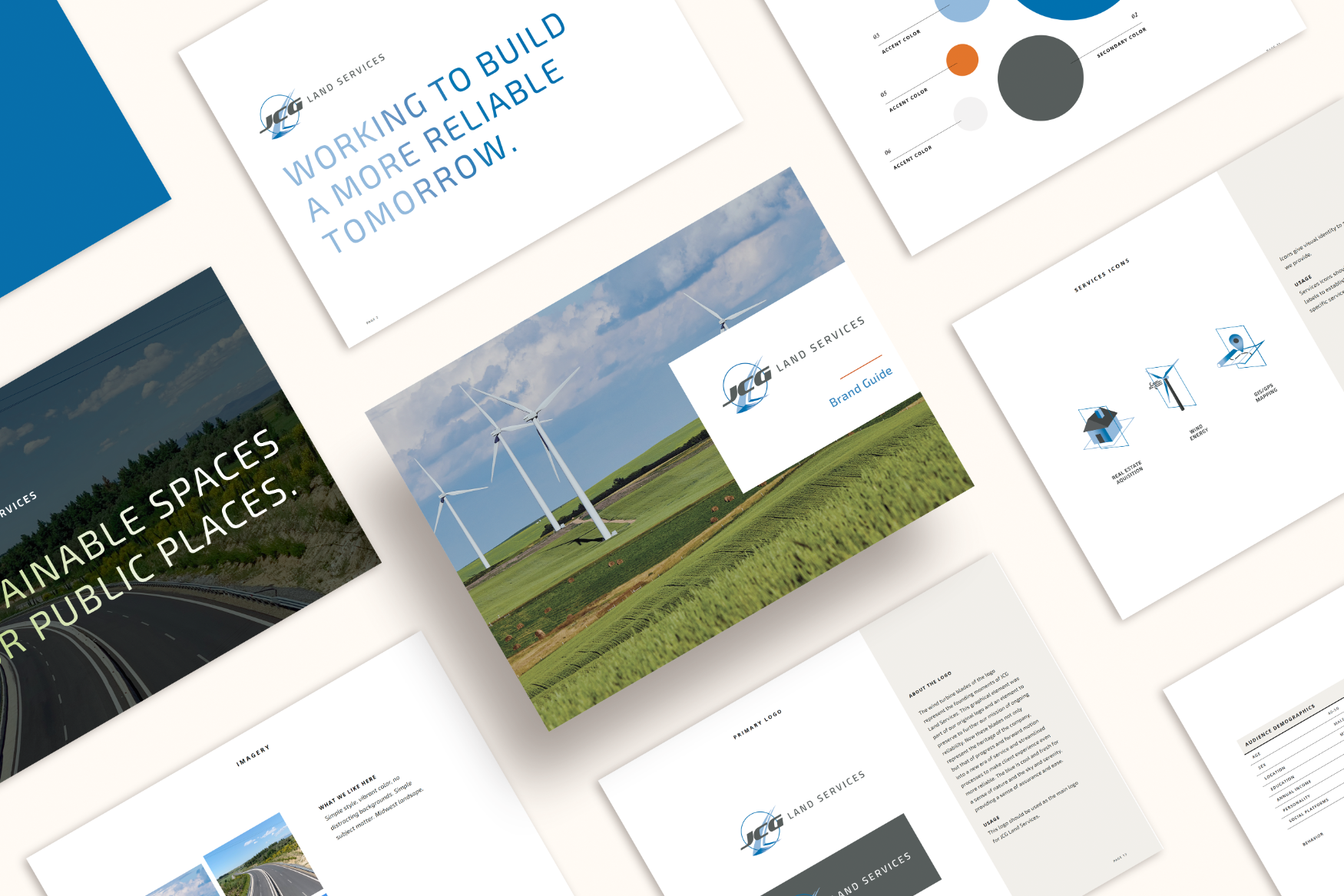
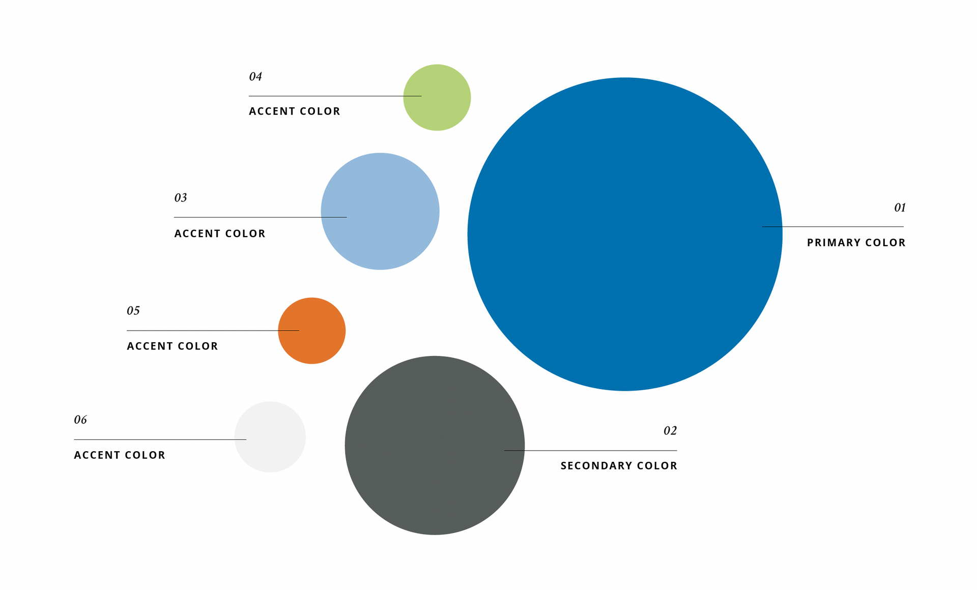
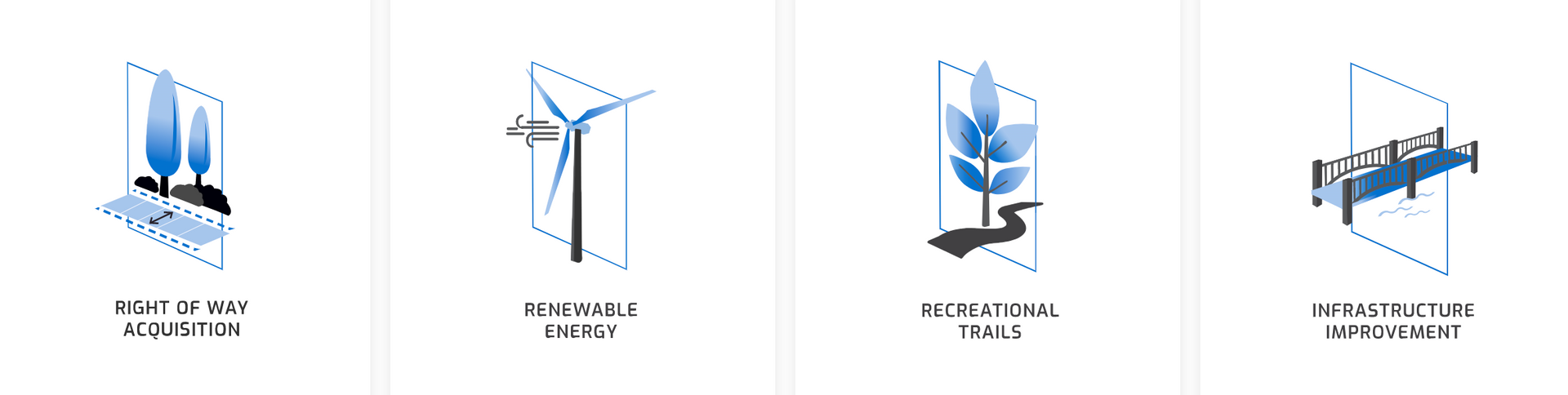
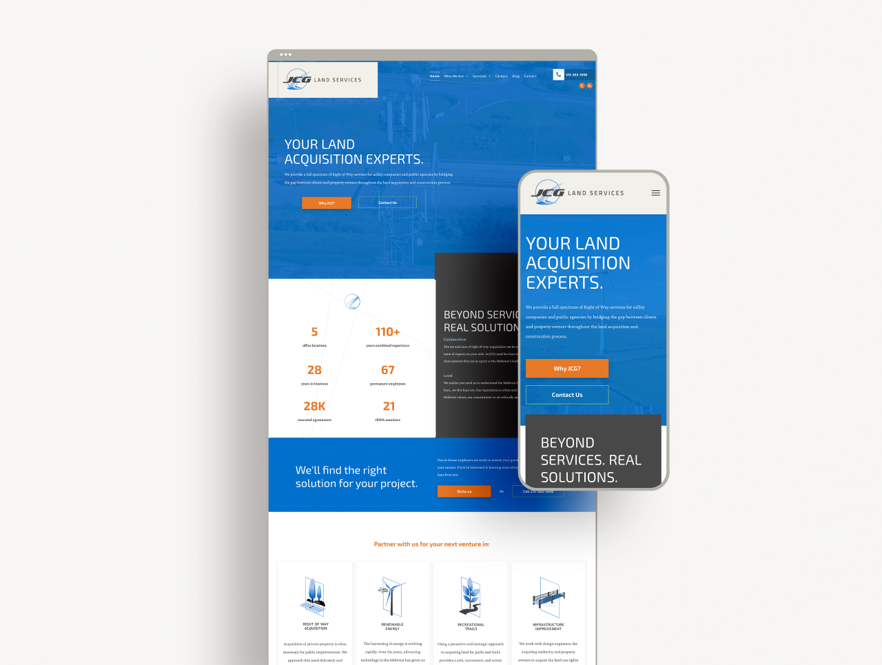
The leadership team at JCG Land Services, a full spectrum right-of-way land acquisition service, knew they had outgrown their existing brand, but they were unsure where to take things from a branding and website standpoint. We worked together on their deluxe branding package with a full branding suite. It was important to them to preserve their history while bringing in the way the industry has evolved, especially in the renewable energy market.
-------
Deluxe Package

,,
Amanda could not have made the process any simpler for us. She took the time on the front end to really learn about our industry, who we are as a company, and what our company culture is so that she could represent these components in all of our branded pieces. The result is a modern look that still retains the history of our 28-year old company, but reflects the evolution of our industry. I'm so glad we selected Studio A to collaborate with on this project!
BRANDY
Chief Growth Officer, JCG Land Services


DESIGN + BRANDING BY :
STUDIO A DESIGNS 💗 AMES, IA 50014

PROUDLY SERVING
CENTRAL IOWA + BEYOND