
Small biz guide to graphic design terms: color explained
While color seems like it should be simple, it can be really frustrating when you are expecting your website colors to match your business card colors…and they don’t.
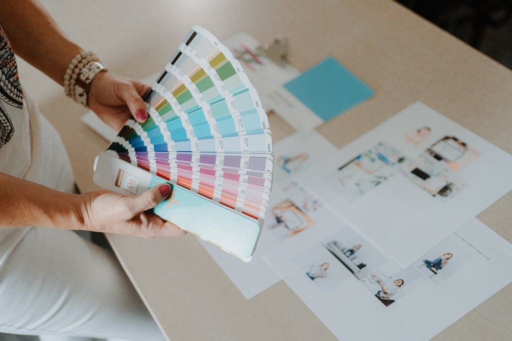
You might not know this about me, but one of my first jobs out of college was in the prepress department at a local commercial printer. Along the way, I had my share of mishaps with color in my own designs, but I also saw a gamut of “color issues” that I had the assigned task of fixing, which has made me an expert on the topic of color.
P.S. This post is part of my “Small Biz Guide to Graphic Design Terms” series. Check out
Typography and
Filetypes too!
Common Color Terms Used in Print & Web Design
I’m breaking down the color terms every small business owner should know to help you make sense of the different color modes, jargon, and common questions I get asked often as a
brand & website designer. Whether you are working with a commercial printer or battling your own office printer, I’ll help you understand color a little more so you can feel more confident when you send over your print files.
Color Modes Made Simple
If you've ever created something on your computer, hit 'print,' and ended up with a color that looks nothing like what you saw on your screen, you're not alone.
While it would be nice to have one color mode for all outputs, unfortunately, screens and printers see color differently. Screens use light (RGB), while printers use ink (CMYK). One is additive (mixing light to make white), and one is subtractive (mixing ink to absorb light and create colors).
That’s why the same color can look bright on screen but dull on paper, and why we need different color modes to get the best results in each format. I am always up for the challenge when I’m creating brands that include brand books, so clients are aware of the potential issues with their colors matching across different brand touchpoints and how to avoid them.
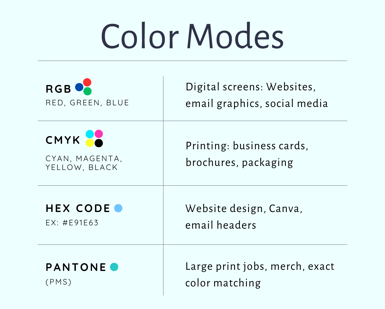
Here is a breakdown of the different color modes seen most often:
RGB (Red, Green, Blue)
Used for anything you see on a screen, like websites, email graphics, and social media posts. RGB colors are created using light, which means they appear more vibrant.
CMYK (Cyan, Magenta, Yellow, Black)
Best for print projects like business cards, brochures, and packaging. This mode uses ink instead of light, which can make colors appear more muted compared to digital screens, but it ensures your printed materials look consistent.
HEX Code (e.g., #E91E63)
These six-digit color codes are used mainly in web design and digital tools like Canva. They’re a web-standard way of pinpointing an exact color. Great for brand consistency online.
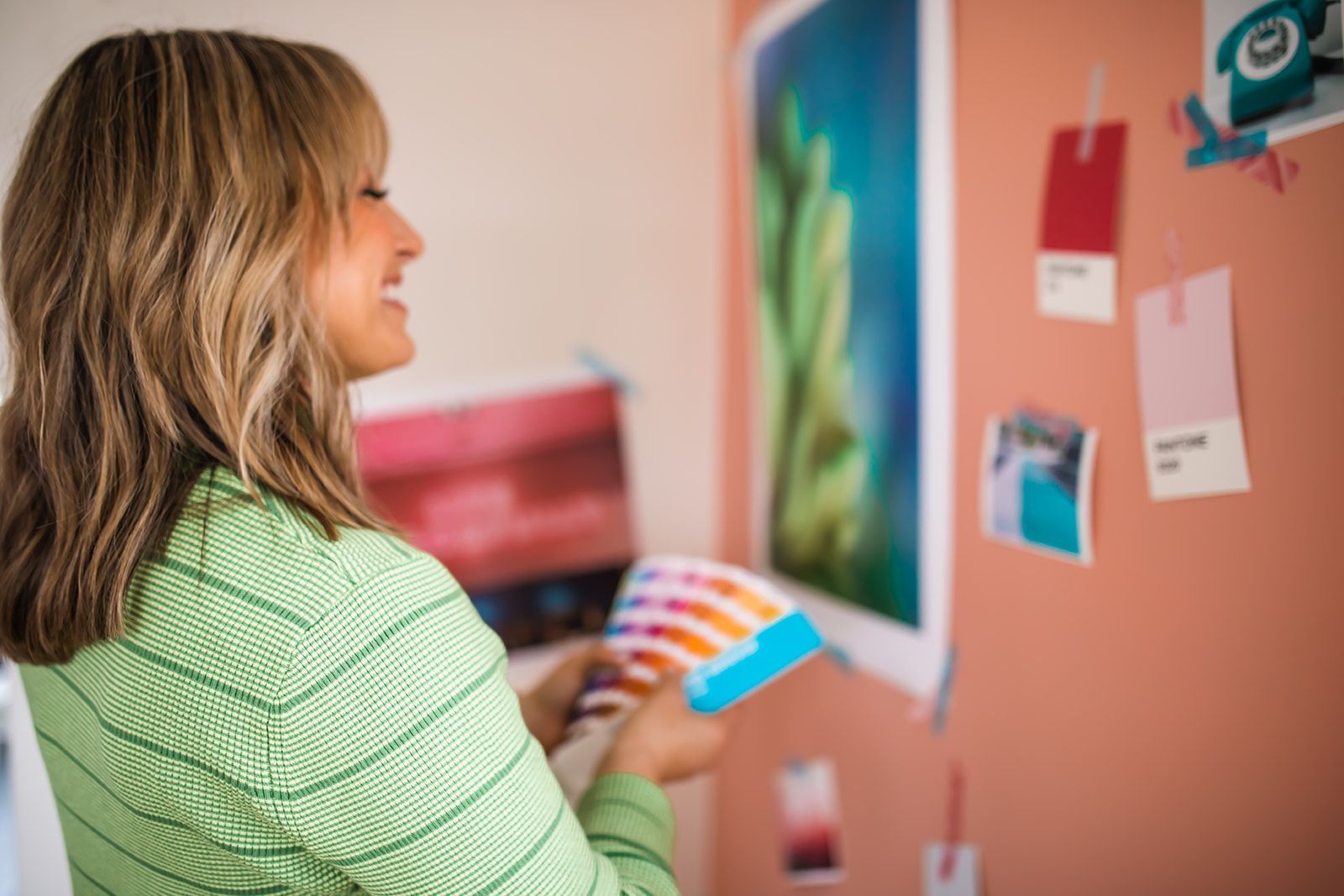
Pantone (PMS)
The gold standard for color consistency in print. Pantone solid colors are pre-mixed inks used when you need a perfect match across multiple materials, like branded merchandise or large print runs. Not always necessary for small projects, but helpful when precision matters.
Check out this quick reference color mode chart to see the output formats recommended between those color modes:
What type of Printers Affect Color?
Not all printers are created equal. Here’s how they stack up for small business use:
Inkjet Printers:
Most common for home use. They’re affordable but not always precise. Colors can bleed slightly and be inconsistent, especially on thin or uncoated paper.
Laser Printers:
Great for text-heavy documents and fast printing. Can be used for color printing but is less reliable for rich, saturated color prints.
Digital Printers:
Used by local print shops. High-quality, flexible, and great for short runs. Usually, your best bet for flyers, postcards, or business cards.
Offset/Press Printing:
Ideal for large quantities. Uses actual plates and ink. This is where Pantone colors shine. More expensive but offers precision and consistency.
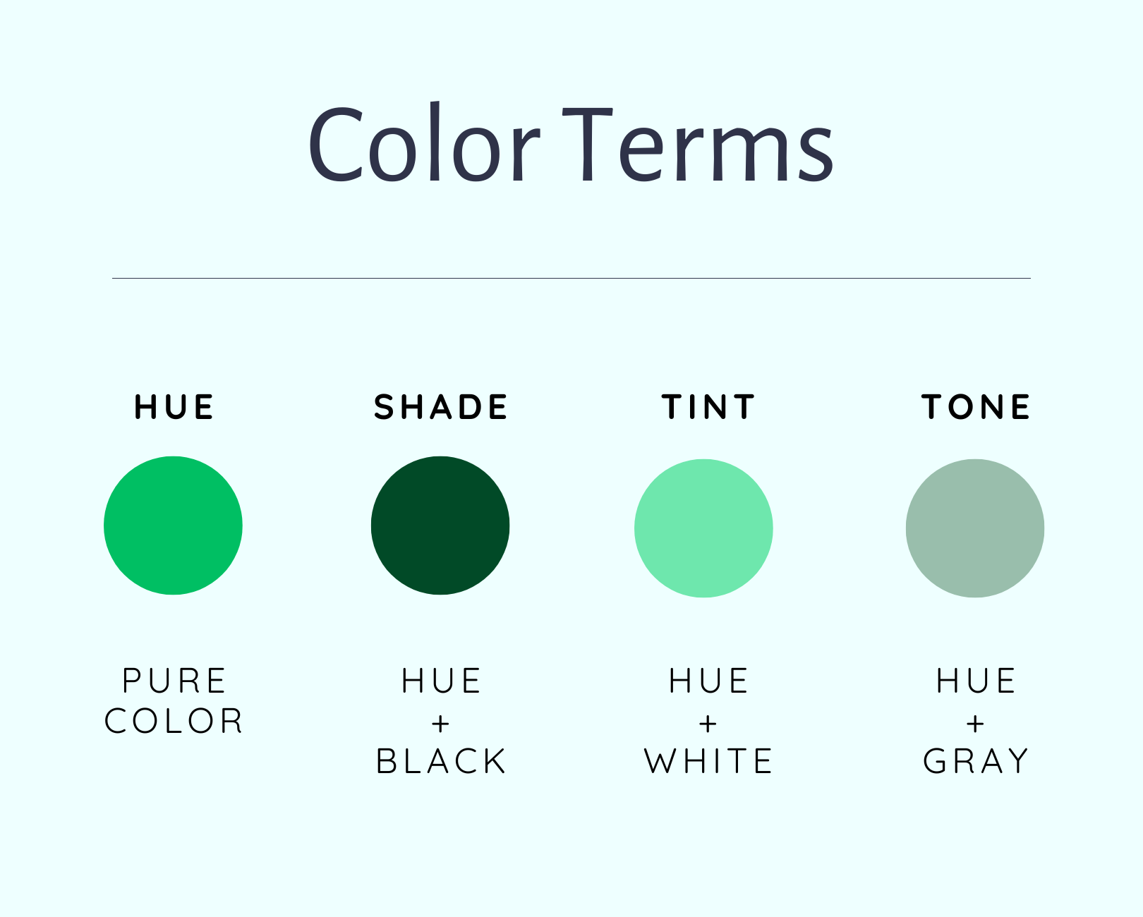
Color Terms You Might Like to Know
Color lingo is fun for designers like me (in case you haven’t noticed by my work). But once you understand the basics, non-designers like you will be tossing around words like "saturation" and "tone" like a total pro.
Check out this quick glossary and chart
- Hue = base color
- Tint = hue + white (lighter)
- Shade = hue + black (darker)
- Tone = hue + gray (muted)
- Saturation = how bold or soft a color is
- Contrast = how different two colors are (important for readability and accessibility!)
Color FAQs for Real Life Small Biz Owners
These are the most common questions I get from clients with some straight forward answers to help things click for you.
Q: Do some colors print more accurately than others?
Yes! Some colors convert from screen (RGB) to print (CMYK) more smoothly, while others shift dramatically. If you’ve ever been surprised by how dull or different your printed colors look, this could be why.
Colors that tend to print well:
- Mid-range blues (dark blue to navy)
- Greens from emerald to forest
- Muted neutrals (grays, taupes, browns)
- Medium reds (not too bright or dark)
Colors that often shift noticeably in print:
- Bright neon tones (electric pink, lime green, highlighter yellow)
- Very saturated oranges (often appear browner)
- Purples and violets (tend to skew blue or look muddy)
- Light pastels (can disappear on certain paper types)
💡 Pro tip: If your brand is strictly used digitally, take advantage of the ultra-bright colors. If you’re going to be carrying your brand between print and web, use ultra bright/neon colors as minimal accents, and stick with mid-to-dark tones, which convert more accurately.
Q: What if I’m DIYing my brand and don’t know which CMYK values to use for printing?
There are some simple tools that can help. If you have chosen your brand colors in HEX or RGB mode (like from Canva), you can find the CMYK values using online tools likeMinify or Colorffy. Just remember: the result might not be exactly the same in print, so always request a proof or test print when possible and ask your printer to help you with color matching.
If you’re using Canva Pro, you can specify CMYK colors in your Brand Kit which will convert when you download a print-ready PDF using CMYK. This is an important missed step. For DIYers using the free version, ask your local print shop to help with conversion or send them your HEX or RGB values and ask them to match it as closely as they can on their end.
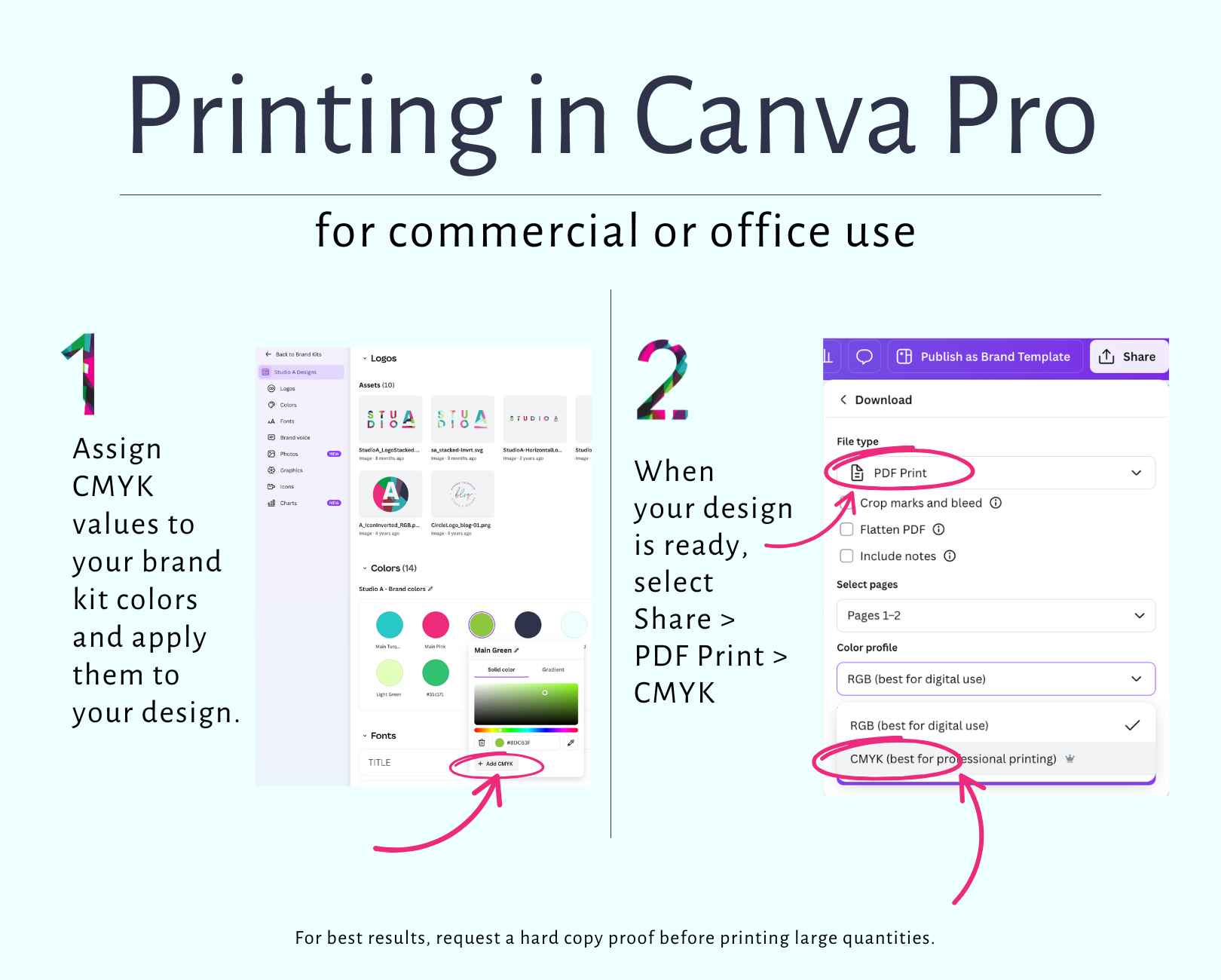
For setting up your Brand Kit, check out Canva Pro Tips for Building Your Brand Kit.
Q: Why does the color look different when I print at home?
Your printer uses CMYK, but most of what you design (like in Canva or Word) starts in RGB. Home printers also vary wildly in quality, ink levels, and settings.
Q: When I insert my logo to Canva or Word, why does the color look completely different?
These programs default to RGB, so expect some shift. If your designer provided you with a CMYK file and you upload it in Canva or Word, the color may not be the outcome you expected.
Q: What if I want to print my Canva file at home?
Canva now lets you download PDFs in CMYK, but only if you have a Pro account. For best results at home. Download as a PDF first before you start printing anything – File > Download > PDF with Best Quality or Color Matching options on will give you a more stable result than printing straight from the browser.
Q: Why does my social media graphic look different on my phone vs. my desktop?
Screens are calibrated differently. Phones usually make colors appear warmer and more saturated. That’s normal, so just make sure your brand palette works across devices.
Q: How do I make sure my logo colors look the same everywhere?
Ask your designer for brand colors in HEX (for web), RGB (for digital), CMYK, and PMS (for print). Save them in your brand guide and paste them into Canva and other templates for consistency.
Q: Should I worry about Pantone colors?
Only if you’re printing large quantities, packaging, merch, signage or want a very accurate color match. For everyday business cards or flyers, CMYK will usually do the trick.
Q: What paper should I choose to get the best color results?
Paper makes a huge difference! Glossy finishes make colors pop, matte is more subtle but can add some sophistication, and uncoated paper can absorb ink and make colors look duller. Always ask your print shop for paper recommendations based on your project.
Q: What vendors do you recommend for printing & production in Central Iowa?
I love working with local printers in central Iowa because they offer physical printed proofs before printing your full project and they take extra care knowing your business means a lot to you.
A few vendors I trust are as follows:
- SignPro - Outdoor & Indoor Signage, Vehicle Graphics
- Heuss Printing - Commercial Printing & Promotional Items
- Integrity Printing - Des Moines
If you feel confident in your colors and output, here are a few online ordering options:
- Moo
- Sticker Mule
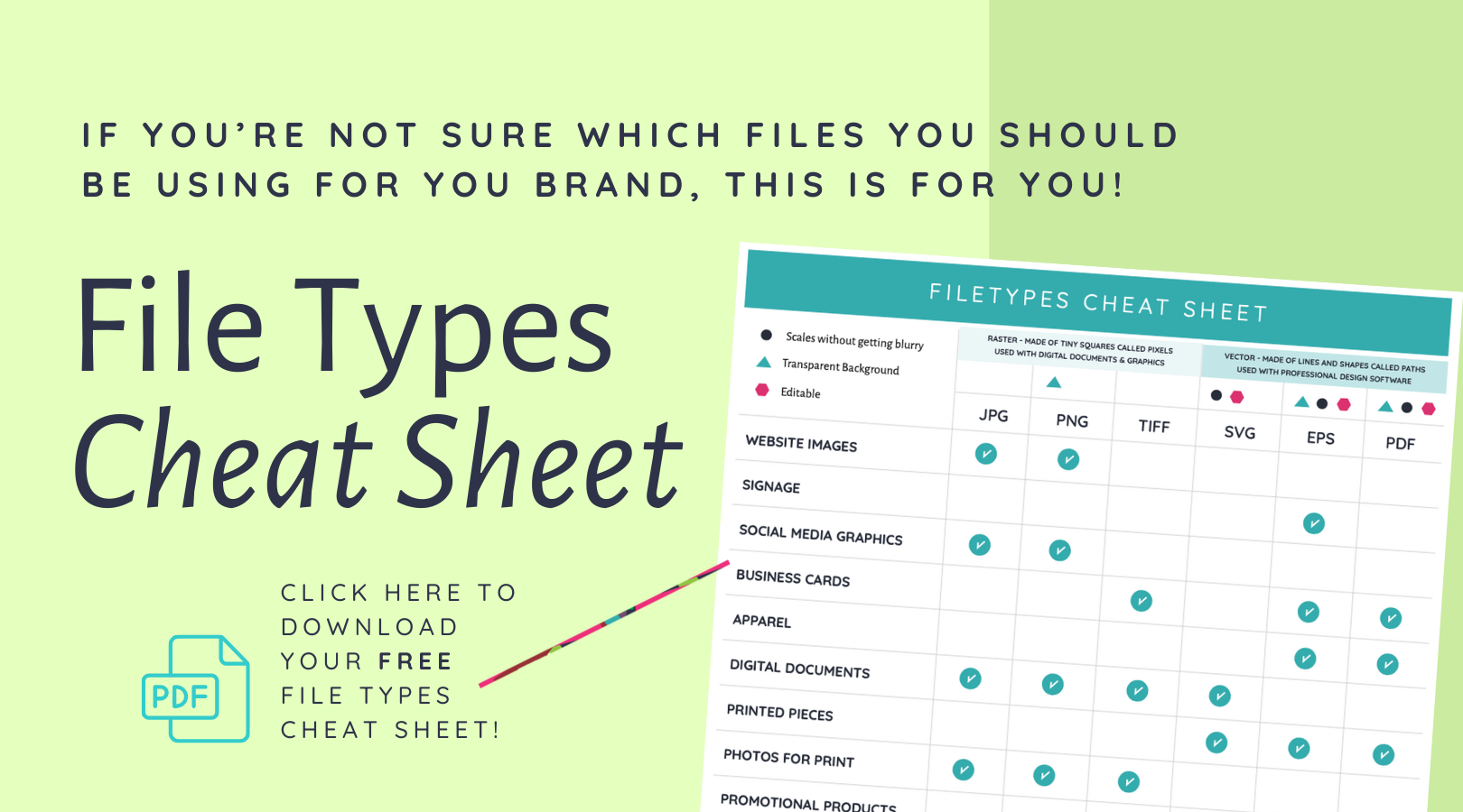
Bonus: Get your Filetypes Cheat Sheet
Color is one piece of the puzzle, filetypes are another, yet they go hand in hand if you are producing something with the right color mode and the right resolution. If you've ever wondered which version of your logo to use or why a designer keeps sending you .EPS files, I’ve got you.
Grab the free Filetypes Cheat Sheet to decode which file to use, for which color mode, when and where.
Want more tips for branding your small business life? Be sure to subscribe to THE A LIST.
Ready to take your Iowa small biz brand from DIY to strategized so you can start attracting the customers you truly want?
Fill out my contact form,
and I’ll send you a link to book a free consulting call.
Your designer friend always,

The A-List is your 60-second inbox scroll for local brand and website tips, savvy small biz resources and the take-aways you need to get through this crazy thing called entrepreneurship.
Join the email community!
Email Community Signup
BLOG TOPICS


BROWSE RECENT POSTS


I get to use creativity everyday to help entrepreneurs focus on their passions to discovering their brand's "sweet spot" in the marketplace...and I absolutely LOVE IT!
I'd love to connect with you to chat more about your business.