Okay, I’ll say it first so you don’t have to.
Branding a pest control company does not sound like the most glamorous project on the surface. I know what you're picturing...bug logos with the 🚫 symbol and likely some of the most generic websites with stock photos of bugs.
But when Preferred Pest Management (an awesome family-owned Iowa small business that’s been serving our community since 1985) came to me, I knew right away this one would be different. And it unexpectedly turned into a favorite project of mine.
What makes trade and service businesses so exciting to me is that the transformations are absolutely DRAMATIC. My bread and butter is creating brands for florists, law firms, travel agents, and downtown shops — and I’m obsessed with every single one of those projects. But every once in a while a trade/service business comes along — think underground utilities, HVAC contractors, or even a can redemption center — and the transformation is so unexpected it kind of blows my mind every time.
That's exactly what happened here.
Let me take you through the whole thing.
Better branding for the Iowa small business that had everything going for it, except a brand to match
Preferred Pest had the thing a lot of established small businesses have going for them: a loyal customer base, a solid reputation, and years of real experience under their belt. What they didn’t have was a brand that reflected any of that.
40 years of great work, and zero brand strategy
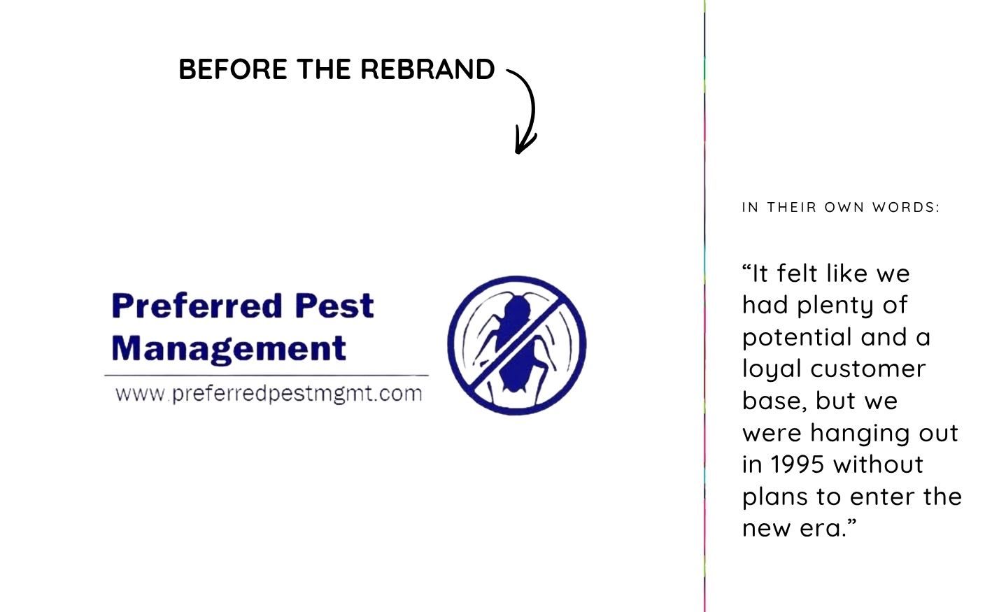
If you’ve been in my corner of the internet for even a minute, you know how I feel about logos being the only form of “branding”. Logos are just a teeny tiny part of branding. And this business was doing all it could with what it was given.
Their old logo was a navy blue bug in a circle. Their website had no personality, strategy, or story. For a business with as much heart as this one, that gap was such a miss.
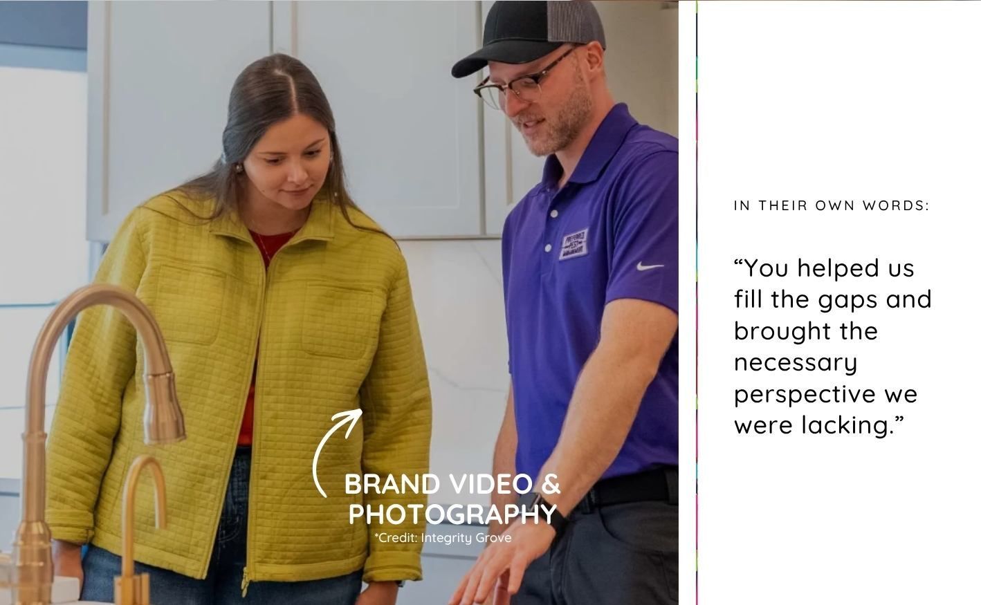
In their own words:
“It felt like we had plenty of potential and a loyal customer base, but we were hanging out in 1995 without plans to enter the new era.”
They weren’t just looking for better branding aesthetically. They wanted something to grow into and a strategy that positioned them as “the bug guys to remember.” That’s exactly why the Deluxe Package was the right choice for them.
The brand strategy workshop was where the real work began
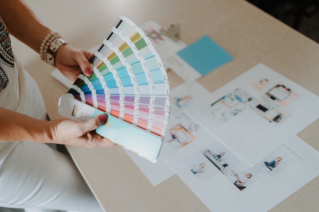
Before a single pixel gets designed or a word gets written for a website, we do the strategy work. This is the piece that separates better branding from just a prettier logo…and it’s my absolute favorite part of the process.
We spent three hours together in a Brand Discovery Strategy Session diving deep into everything that makes Preferred Pest who they are. We talked about:
- How to preserve the trust they’d already built in the community
- Where they wanted to grow their name recognition
- What their “wow-factor” really could be (more than just “good customer service”) but something that really set them apart
- Their ideal client and the emotional reality that person brings (spoiler: nobody likes bugs)
- The internal culture shifts they wanted to make alongside this rebrand
- The visual mood and market positioning that felt right for who they are
We found that this company is light-hearted, nostalgic, neighborly, professional, local, and genuinely unexpected. They had all this personality sitting right below the surface; we just needed to bring it out and make it work for them.
Copywriting & messaging that turned the brand's personality into words
Once the strategy was locked in, it was time to write. As part of Studio A’s Deluxe Package, I handle all the copywriting because your brand voice is only as good as how it reads on the page (and the screen).
For Preferred Pest, I leaned hard into the light-hearted, approachable side of who they are while still communicating trust and professionalism. The result was messaging that actually sounds like them:
“Your peace of mind lives where pests don’t.” — speaks directly to the customer’s emotional aversion to bugs
“Big enough to serve. Small enough to care.” — honors their small business Iowa roots and local reputation
“Pest control should be the easiest thing on your to-do list.” — meets the customer where they are
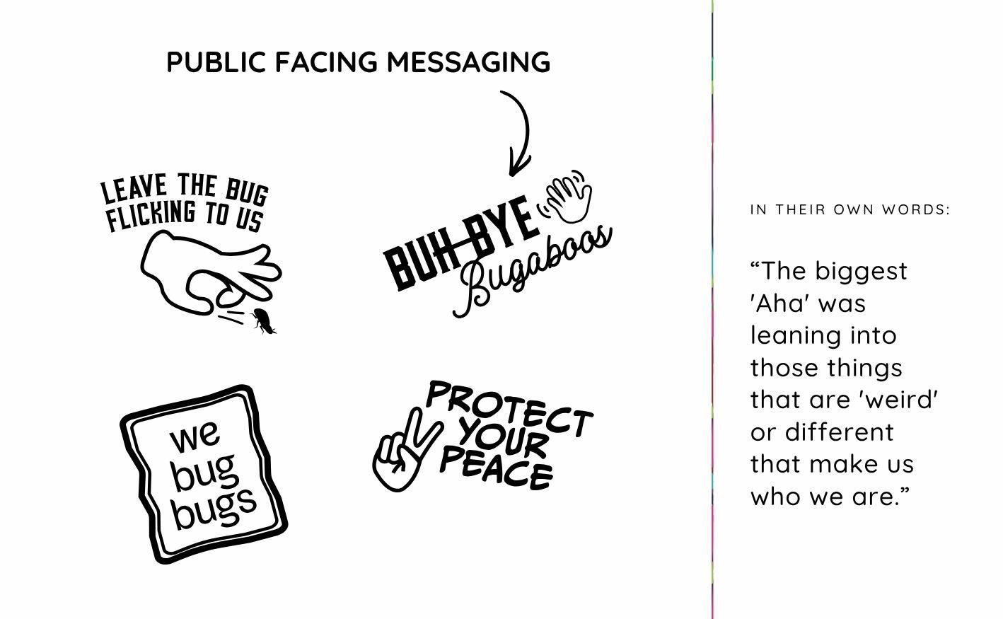
And then there were the fun/lighthearted brand phrases that really made this whole thing sing: “Leave the bug flicking to us,” “Buh-Bye Bugaboos,” “We bug bugs,” and “Protect Your Peace.” These aren’t throwaway taglines. Every single one came directly from the strategy work we did together.
Brand strategy goes beyond the logo (Yes, Really)
As I said before, I talk a lot with small business owners in Iowa who now know that better branding isn’t just what your brand looks like. It’s the essence and vibe of everything, including mapped-out customer touchpoints.
As part of the strategy, we mapped out customer touchpoints. The little moments that add up to a big brand impression. For Preferred Pest, that meant things like sending a short video recap after a service visit when the homeowner isn’t home, washing the customer’s front window as a finishing touch, and building in personalized follow-ups that feel neighborly, even down to messaging examples in an appointment reminder texts. These are the Ritz-Carlton moments I aspire to in my own brand, and so should you, regardless of your industry.
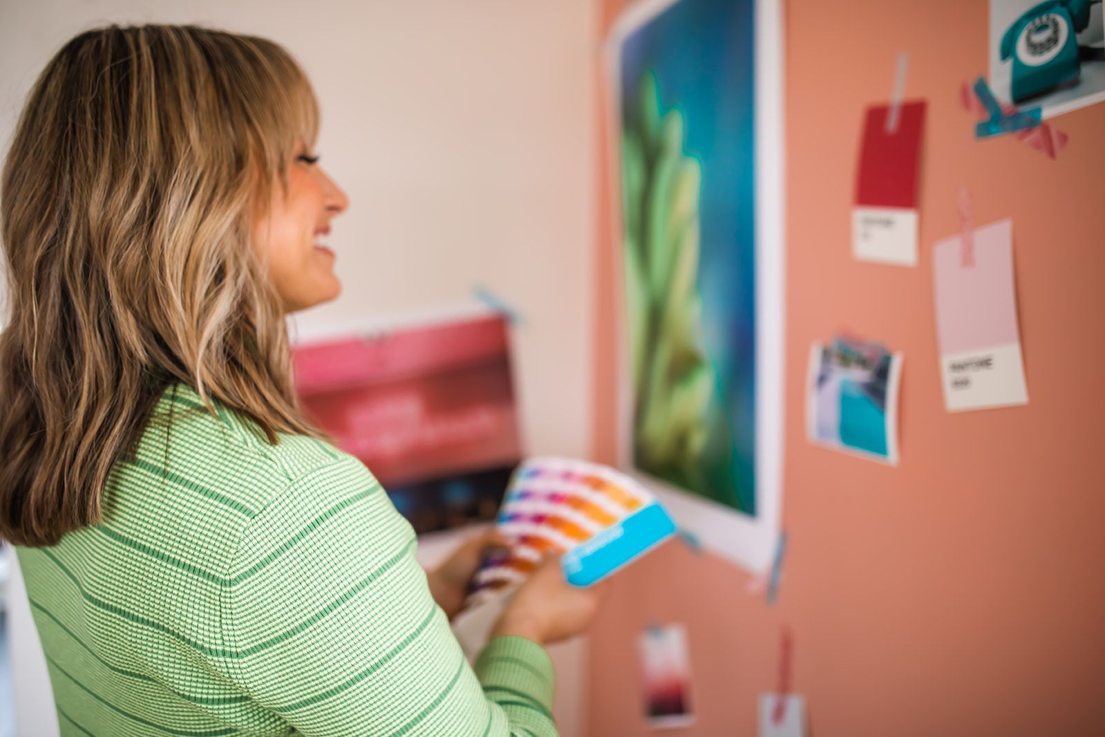
The visual brand identity & the color purple as a brand identifier
Only after all that strategy work did we move into the visual identity phase. The direction we landed on was bold, nostalgic, and completely unexpected for a pest control company, which was exactly the point.
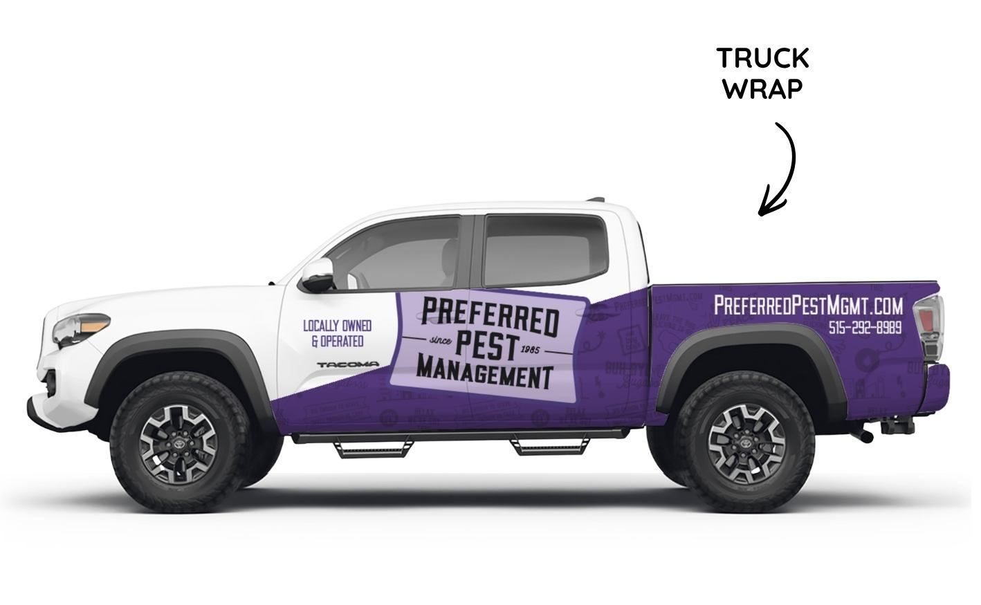
The new brand features:
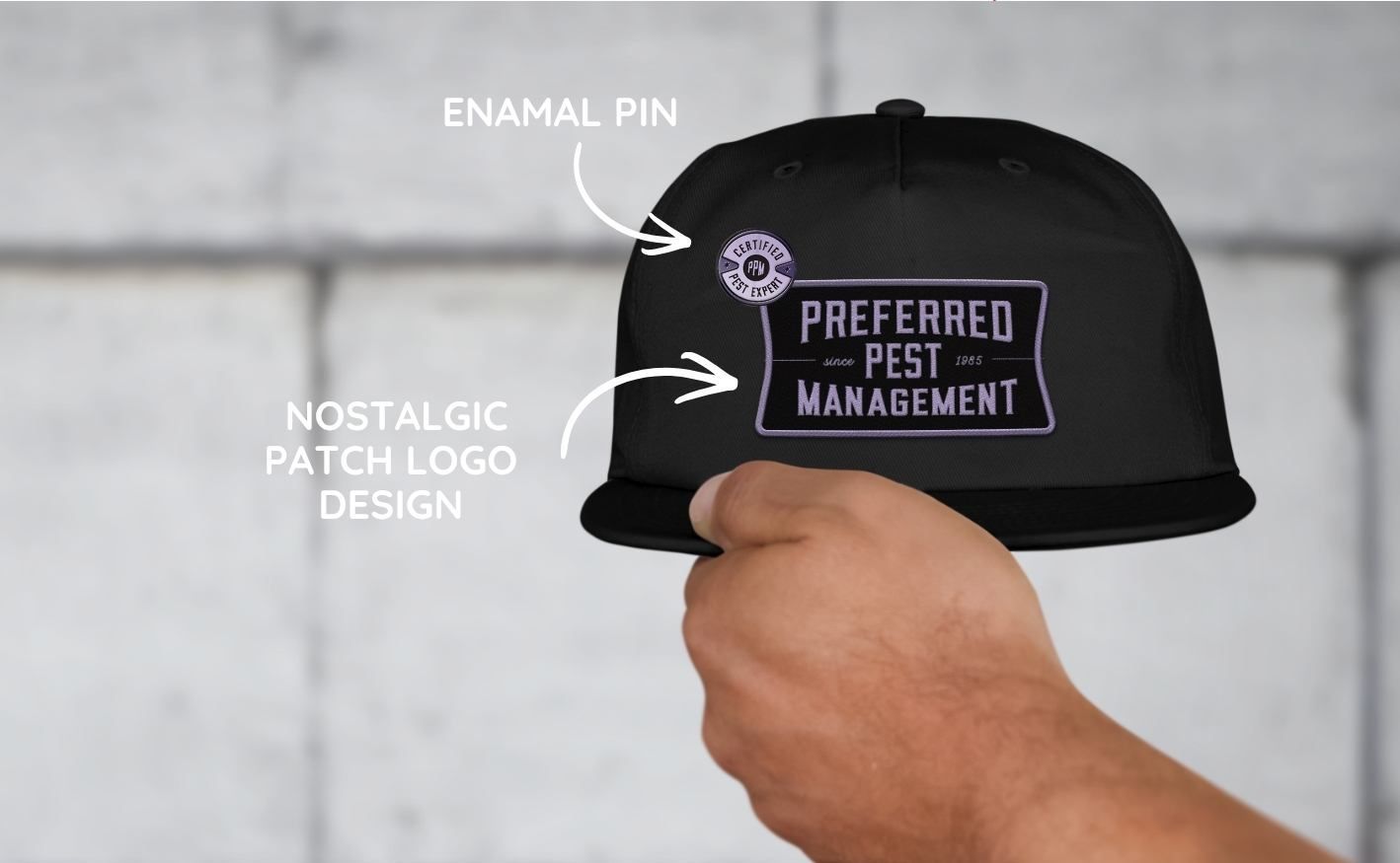
- A nostalgic patch-style logo designed to work beautifully on uniforms, hats, and truck wraps
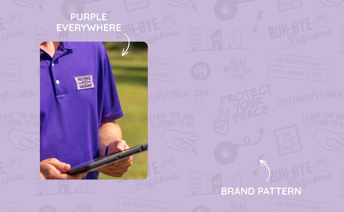
- Unexpected and memorable, bold purple as the signature brand color
- A custom brand pattern loaded with all the fun messaging elements we developed in strategy
- An enamel pin to signal expertise and professionalism (the details matter!)
- A full truck wrap that turns their fleet into a moving billboard for the Purple Pest Pros
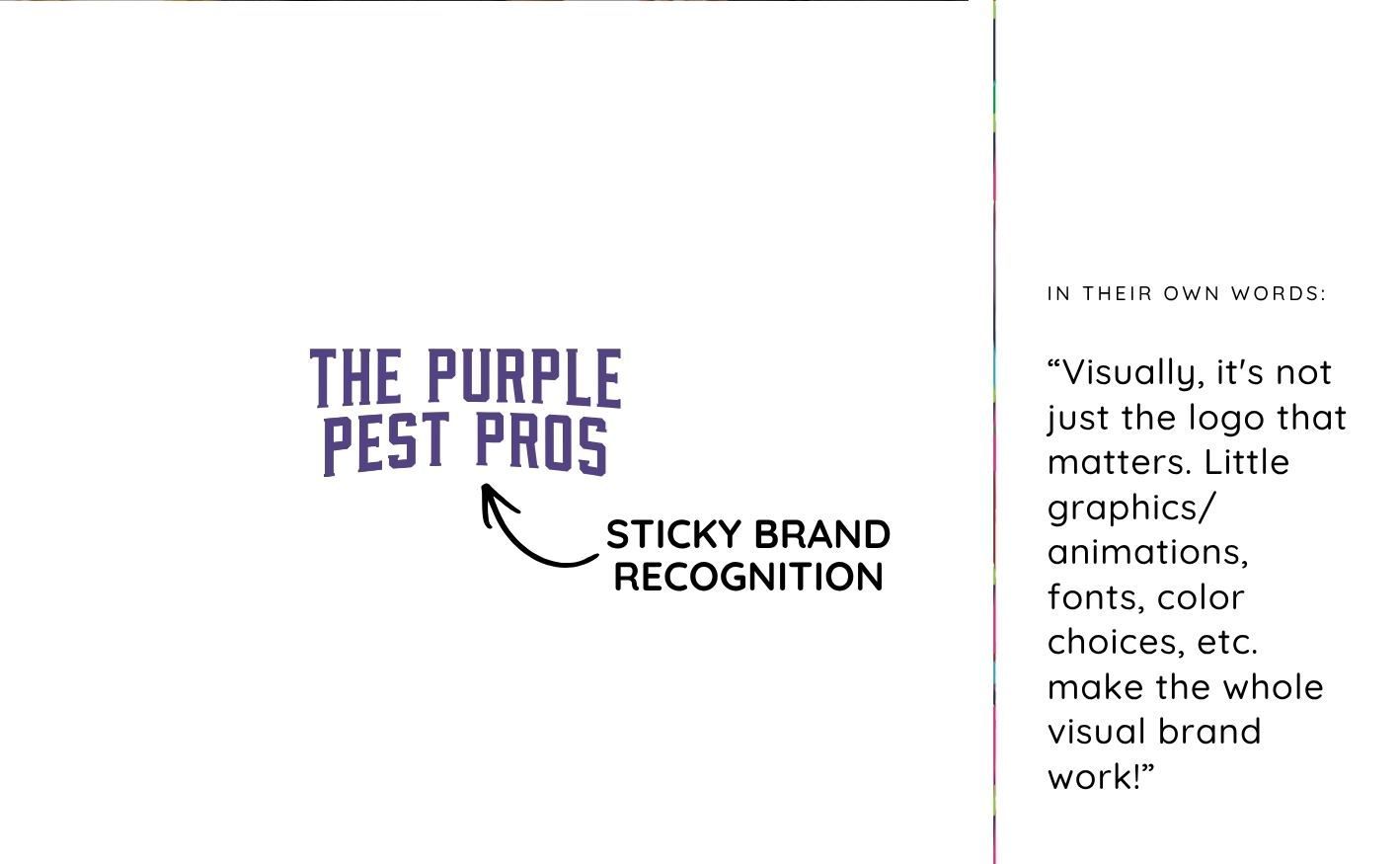
- The nickname “The Purple Pest Pros”, which emerged naturally from the brand work. That’s what sticky brand recognition looks like.
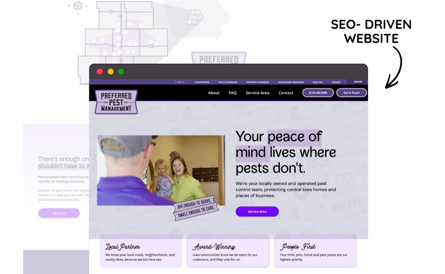
SEO-Driven strategy meets website design & development
The last piece of the Deluxe Package is where everything comes together: the website. And as an SEO specialist serving small businesses in Iowa, this is where I get to nerd out a little.
The new Preferred Pest Management website wasn’t just designed to look good. It was built with SEO strategy baked in with the right keywords, the right structure, and the right content to help local homeowners and property managers actually find them when they’re Googling for pest control help in Iowa.
The website copy carries all the brand personality we developed together. The messaging is clear, the calls to action are obvious, and the whole experience guides visitors exactly where they need to go.
Here’s Where They Are Now
In their words:
“You filled the gaps and brought the necessary perspective we were lacking. We not only have an attractive brand, but we also have a north star to shoot for and promises to live up to.”
That right there is what better branding actually does for a small business. It’s not all about looking a certain way (though it definitely helps), it’s having a foundation that guides your decisions, team, and your customers for years to come.
Is Your Small Business Ready for Better Branding?
If you’re a small business owner in Iowa who’s been operating with a brand that just doesn’t feel like you, I want you to know that better branding is 100% possible for businesses of all kinds. Pest control companies. Service businesses. Creatives. You name it.
The Deluxe Package is my full-service brand and website experience: strategy, copywriting, visual identity, SEO, and a website that actually works for your business. It’s everything in one place.
Sound like what you’ve been looking for? Book your complimentary call.
Your designer friend always,
Frequently asked questions about brand logos.

The A-List is your 60-second inbox scroll for local brand and website tips, savvy small biz resources and the take-aways you need to get through this crazy thing called entrepreneurship.
Join the email community!
Email Community Signup
BLOG TOPICS


BROWSE RECENT POSTS


I get to use creativity everyday to help entrepreneurs focus on their passions to discovering their brand's "sweet spot" in the marketplace...and I absolutely LOVE IT!
I'd love to connect with you to chat more about your business.