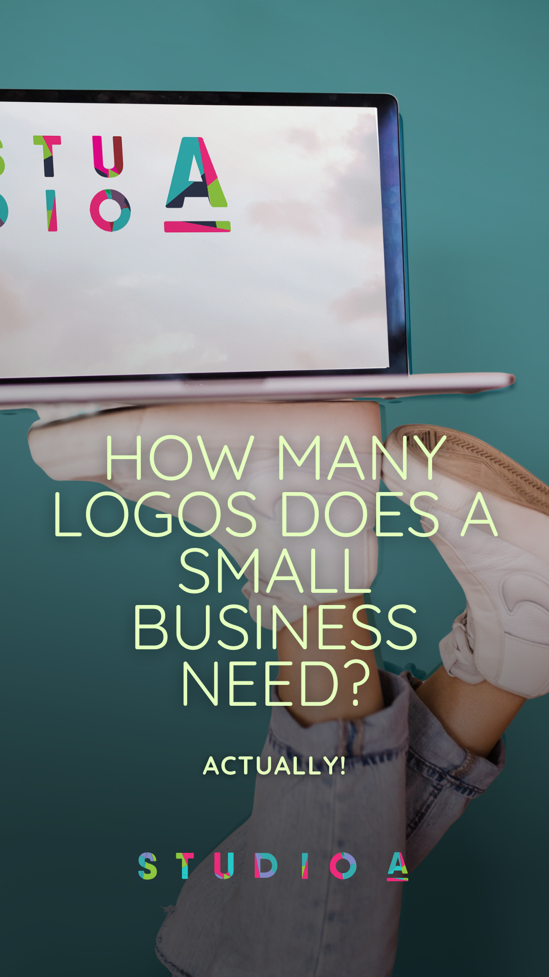
How many logos should a brand have?
If you’ve landed on this page, there’s a good chance you’re smack in the middle of working on a logo for your business and suddenly wondering: how many logos should a brand have?
Maybe you’ve created one logo already. Or you’re working with a designer and they’ve started talking about logo variations.
And now you’re thinking… wait.
Do small businesses really need more than one logo?
The short answer is yes. Most brands don’t rely on just a single logo. Instead, they use a group of logo variations that allow their branding to work across websites, social media, print materials, and everything in between.
So if one logo isn’t enough, what’s the right number?
Here’s the short answer: Most brands have three to five logo variations to keep their branding flexible and consistent across different platforms.
Instead of relying on just one logo, most small business brands use a logo system that includes a primary logo, a secondary logo, a submark, and a brand icon.
This allows the brand to stay consistent across different platforms like websites, social media, print materials, packaging, and more. These four core logos are the minimum I typically recommend for clients. Without them, brands start running into frustration with spacing, scaling, and trying to squeeze logos into working everywhere.
Most brands have these logo variations that make up a suite of logos:
- Primary logo: the main logo used in major brand placements
- Secondary logo: an alternate layout for different spaces
- Submark logo: a simplified version for small uses
- Brand icon, also called a logo mark: used for social profiles or favicons
Here’s why one logo just doesn’t cut it
At first, it might feel like overkill to have multiple versions of your logo, but once you start using your logo in different places, you’ll quickly realize that one static logo can start to look really awkward. Even if your one primary logo is beautiful on its own.
Here are a few reasons having more than one logo variation is better.
Different platforms require different shapes
If you design a primary horizontal logo, the proportions of a wide logo are not going to translate well to the square social media profile image or in certain vertical layouts. Another example is with websites. As a website designer, I often switch the logo from a stacked version on the desktop view of the website to a horizontal or an abbreviated submark on the header of the mobile version.
Readability can be tricky at small sizes
A detailed logo with a graphical element may look great on a large format sign, but may overpower or look jumbled on a polo, or even a business card, for instance. And as a social media icon, or on a mobile device, the text can become nearly unreadable. Of course, no one wants to have their audience squinting to figure out whose social profile they are looking at. You want INSTANT recognition, right?
Brand recognition needs to work across your marketing
A logo system prevents stretching and cropping your logo in ways that weaken your brand. When brands use variations designed from the same system, they indicate to your audience that you are reliable and trustworthy.
A logo system makes marketing easier
A logo has to do a ton of work to represent your brand. More than likely, it appears on almost every marketing piece you create.
Often, you first create a logo for one layout, then tweak it to fit another space, and again and again. This can cause a lot of extra headaches and time. If you have a core logo system, your brand will be versatile enough to be recognized in all the places your brand is found, from signage to email signatures, from merch to presentations, from social media to your website.
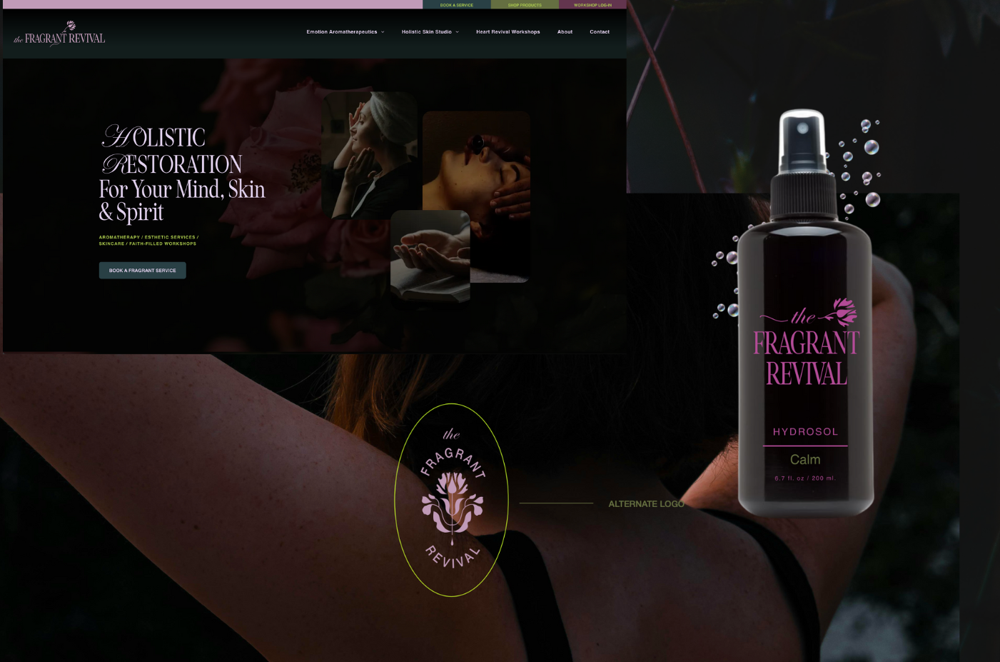
The logo types most brands need
Primary Logo
Your primary logo is the main version of your brand identity. It’s probably the one you’ve already been using. It typically includes the full business name and may sometimes include a symbol or icon. This is the full version, used for websites, signage, and major brand placements. And depending on the brand, there may be multiple color variations too. (More on that later)

Secondary Logo
A secondary logo is an alternate layout of your primary logo. It often rearranges the same elements from the primary logo into a different shape making it easier to fit into different design spaces.

Submark
A submark is a simplified version of your logo, often using initials or a badge orientation. The full name isn’t typically fully displayed. These are perfect for small placements like social media profile images, stamps, watermarks, or packaging.

Logo Icon
A logo icon is the most simplified way to represent a brand. It’s usually a standalone symbol used in very small spaces like social media icons or browser favicons.

Other logo variations that strengthen a brand Identity
Beyond the main logo suite above, some brands have additional variations that help their branding stay flexible and creative across different applications. These optional versions are a favorite for some brands. It’s best to decide what places you’ll be using your brand most often to decide how far you want to take it.
Logo With Tagline
Typically, the primary logo, with the tagline applied to it in some way, allows for a better explanation for who the brand is or what it stands for.
Word Mark
Sometimes, if the primary logo has graphical elements that take up space, it is helpful to have a simplified version without the graphical element. A word mark is the text portion of the logo.
Favicon
A favicon is the tiny icon that appears in a browser tab. Because it’s extremely small, it often requires a super simplified version of the logo and is usually only used there. Most favicons are a single letter, initials, or a very simplified icon.
One-Color Logo
A single-color version of your logo works well for embroidery, engraving and decals. A strong logo should always work in full color and one color.
Inverted (or Reversed) Logo
This is a light-colored version of the logo, designed specifically for dark backgrounds. It’s designed for contrast. These are very commonly used for website banners, dark social graphics, photography backgrounds, and packaging.
Badge or Stamp Logo Variation
Some brands create a badge-style variation, where the logo elements are arranged inside a circle our outlined to work well on a sticker, merch, stamps, or patches.
How many logos should a brand start with?
For most small businesses, a simple logo system works best.
A typical starter logo package includes:
- 1 primary logo
- 1 secondary logo
- 1 submark
- optional brand icon
This gives your brand flexibility without creating extra complexity.
Logo systems > Just a Logo
Strong brand identities are created around a flexible logo system.
Your brand shows up in a lot of places these days. Expecting one logo to work perfectly in every single one of those spaces is like me trying to wear my roller skates to the gym.
I mean… I could. 🛼💪🛼💪
A set of thoughtfully designed logo variations paired with a strategy for communicating your message gives your brand the flexibility it needs to look polished everywhere it appears.
If you’re curious about what a full logo suite actually includes, take a look here.
Your Brand > Logo System
By now you can see that most brands don’t rely on just one logo. They use a small set of variations so their branding can adapt to different spaces.
But there’s another important piece to this conversation: your brand is more than just a logo.
Logos catch eyes, Brand strategy wins hearts!
A set of logos for your business isn't the brand itself.
A logo or even a logo system is a great starting point, but without a strategy to use, it will only get you consistent visuals, for sure. A brand strategy is a way forward for how a brand speaks to its audience, through helping them understand your “why”, what makes you different from others in your space, your culture, your essence and personality, your audience, messaging tone of voice, and so much more.
When all of these elements work together, they create a cohesive brand that people recognize, remember, and keep coming back to.
That’s why professional branding projects typically start with strategy first, clarifying things before any logos are designed. Take a look at client Sandra, who partnered with Studio A to create a strategy that worked for her multi-service business.
Once that strategic foundation is in place, the logo system becomes part of a much larger and personalized identity, designed to support your brand across every platform.
So if you’ve been wondering whether your business really needs more than one logo, the answer is simple:
YES!
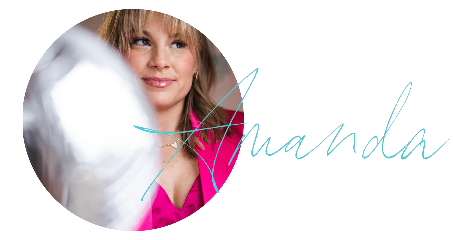
Your designer friend always,
Frequently asked questions about brand logos.

The A-List is your 60-second inbox scroll for local brand and website tips, savvy small biz resources and the take-aways you need to get through this crazy thing called entrepreneurship.
Join the email community!
Email Community Signup
BLOG TOPICS


BROWSE RECENT POSTS


I get to use creativity everyday to help entrepreneurs focus on their passions to discovering their brand's "sweet spot" in the marketplace...and I absolutely LOVE IT!
I'd love to connect with you to chat more about your business.